Ada’s Food + Wine
Ada’s Food + Wine is a great example of hard work and talent. They are diligent about providing a high class but unique dining experience, and they are internationally recognized for having the most eccentric wine list. As a result, a revamp to their branding was needed to showcase their new status.
Project Overview
Challenge
Ada’s Food + Wine’s previous branding leaned heavily toward the quirky suburban demographic of their neighborhood. We wanted to take the base of this and strip it down to be more restrained and elevated, while not alienating their current clientele. Additionally, we wanted to ensure that this branding could expand past their suburb and into the larger city and international scene.
The Process
I collaborated with key stakeholders to define a type of style that they were aiming for. I researched into Michelin guide restaurants across the country that had a clean, streamlined, and youthful aesthetic. There were several iterations on layouts and typefaces until we reached the desired outcome, and even adjusted their logo.

The Result
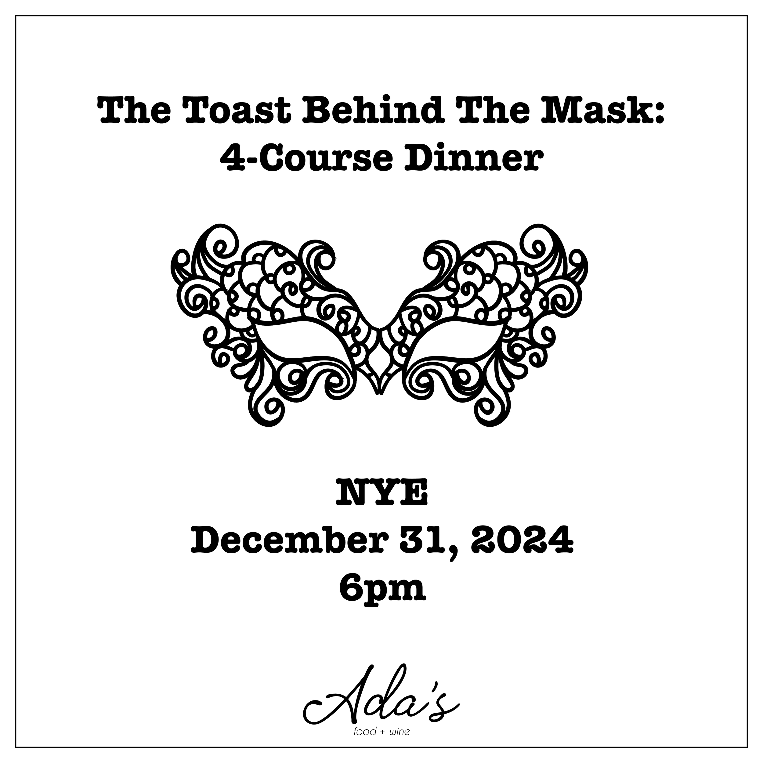
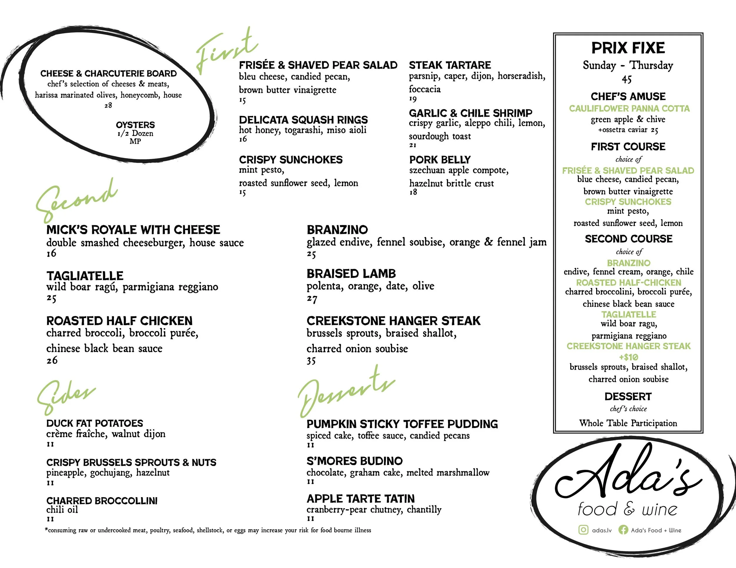
For Ada’s Food + Wine, I revamped the brand's color guide to create a more restrained and elevated aesthetic, aligning with their vision of sophistication while maintaining approachability. I also developed templates for events, ensuring consistency across both physical and digital materials, which helped streamline their branding efforts. The main focus of the menu redesign was to offer more open space and flexibility, allowing for easy updates and the addition of daily specials. These updates contributed to a noticeable 14% growth in overall sales and helped the restaurant connect with the younger demographic they had been targeting, driving increased foot traffic from this audience. As a result, Ada’s Food + Wine is now considering expansion, further validating the success of these design changes in attracting new customers and solidifying the brand’s position in the market.